Your SaaS pricing page is the highest-leverage conversion asset on your entire website. It is also the most underinvested. Most B2B SaaS teams spend 6 hours optimizing pricing across the entire lifecycle of the company, then wonder why trial conversion has stalled at 4% and customer acquisition cost keeps climbing. Pricing pages are not price lists. They are decision architectures that walk the buyer from awareness to action, and the gap between an average pricing page and a high-converting one is worth 20% to 30% of ARR.
If you are a SaaS CEO running a $10M to $40M ARR business and looking at flat trial signups, your pricing page is the fastest place to compound returns. A pricing-page-to-trial conversion rate of 8% to 12% is good. 15% to 25% is great. The companies hitting the great band are not better marketers. They have engineered the page as a system: tier structure, anchoring, social proof, friction reduction, and continuous A/B testing. This article installs that system. Benchmarks throughout are sourced from Lenny Rachitsky's free-to-paid conversion analysis, Kyle Poyar's 2026 Free-to-Paid Conversion Report, and ChartMogul's SaaS Conversion Report.
What you will learn in this article:
- The conversion benchmarks every B2B SaaS pricing page should beat in 2026
- The 7-element anatomy of a high-converting SaaS pricing page
- How to use anchoring, decoy effect, and tier structure to drive plan selection
- The annual/monthly toggle hack that adds 15% to 20% ARR with zero price change
- Friction reduction tactics that lift signup conversion 15% to 25%
- Mobile and AI search (AEO) considerations for 2026
- A 90-day pricing page optimization playbook with named milestones
Key Takeaway
The pricing page is the bridge between marketing and revenue. Treat it as a decision architecture, not a price list. Every element on the page either reduces friction, builds trust, or directs the buyer toward the right tier. Everything else is decoration that costs you trials.
What Are the B2B SaaS Pricing Page Conversion Benchmarks for 2026?
The benchmarks vary sharply by conversion path. For B2B SaaS running a free trial with no credit card required, good performance is 8% to 12% trial-to-paid conversion within 6 months, and great performance is 15% to 25%, per Lenny Rachitsky's compilation. For free trials with credit card required, the conversion bar shifts dramatically upward: good is 25% to 35%, great is 50% to 60%, because the credit card barrier filters intent. Freemium with sales assist sits between, at 5% to 7% good and 10% to 15% great.
The pricing-page-specific benchmarks are equally diagnostic. Bounce rates of 40% to 50% are healthy for B2B SaaS pricing pages; anything above 60% signals a messaging or traffic-segmentation problem, per CausalFunnel's 2025 industry bounce-rate benchmarks. The pricing page itself typically captures 8% to 15% of total site traffic for product-led growth companies and 3% to 8% for sales-led companies, with Userpilot's conversion research documenting that pricing-page visitors convert at 5 to 10 times the rate of other landing pages because intent is concentrated.
| Conversion Path | Good (median) | Great (top decile) | Source |
| Free trial, no credit card | 8 to 12% | 15 to 25% | Lenny / Growth Unhinged 2026 |
| Free trial, credit card required | 25 to 35% | 50 to 60% | Growth Unhinged 2026 |
| Freemium self-serve | 3 to 5% | 6 to 8% | ChartMogul SaaS Conversion Report |
| Freemium with sales assist | 5 to 7% | 10 to 15% | Lenny / FirstPageSage 2026 |
| Pricing-page bounce rate | 40 to 50% | <35% | CausalFunnel 2025 |
Sources: Lenny Rachitsky on Free-to-Paid, Growth Unhinged 2026 Report, ChartMogul SaaS Conversion Report, FirstPageSage 2026 Freemium Benchmarks
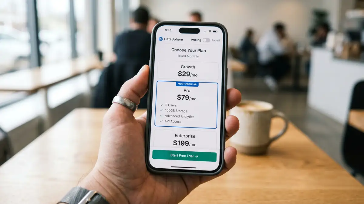
What Is the Anatomy of a High-Converting SaaS Pricing Page?
A high-converting B2B SaaS pricing page has seven elements arranged in a deliberate vertical hierarchy. Strip any one of them and the conversion rate drops measurably. Add them in the wrong order and you confuse the buyer. The order below reflects the patterns that recur across Paddle's best SaaS pricing pages teardown and CXL's 8 keys to value-based SaaS pricing pages.
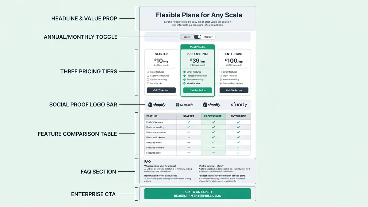
Headline and Value Proposition
One sentence above the pricing cards that names the outcome the buyer is paying for. Not the product. The outcome. "Pricing built to scale with your team" beats "Choose your plan." It sets the frame before price anchoring begins.
Annual / Monthly Toggle (Annual Default)
The single highest-leverage element on the page. With monthly default, 70% to 75% of buyers choose monthly. With annual default, 55% to 65% choose annual, a 15 to 20 percentage-point shift that lifts ARR by 15% to 20% with zero price change. Source: Sixteen Ventures on pricing-page discounts.
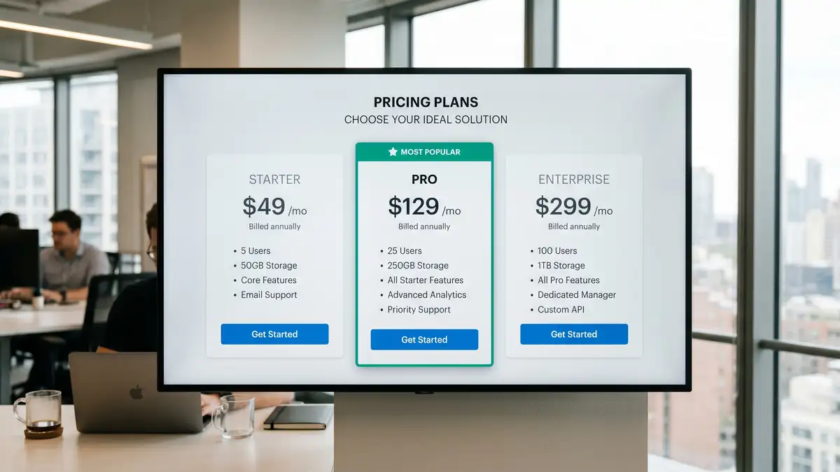
Three Pricing Tiers with Decoy Emphasis
Industry standard is 3.5 tiers (sometimes 4 with Enterprise). The middle tier should be visually elevated with a "Most Popular" badge. With no emphasis, 40% to 50% of buyers select the middle tier. With decoy emphasis, that jumps to 55% to 65%, lifting ARPU 7% to 8%. Source: The Decision Lab on the decoy effect.
Social Proof Bar (Above the Fold)
Logo bar with 8 to 12 recognizable customers, sat above the primary CTA. Add a G2 or Capterra badge displaying current rating (sub-4.5 stars hurts; do not show if below). Testimonials outperform logo bars by 35% in conversion lift, per Tryflint's social proof analysis, so pair them.
Feature Comparison Table
3 to 5 meaningful differences between tiers, not 15 to 20. Pipelineroad's pricing-page research shows decision paralysis kicks in above 7 to 8 feature rows. Differentiate cost-based features (seats, API calls, storage) at lower tiers; value-based features (SLA, compliance, custom integrations) at higher tiers.
FAQ Section (Pricing-Specific)
5 to 8 questions scoped strictly to pricing (contract terms, cancellation policy, annual vs monthly, upgrade/downgrade, support SLA, security). Not generic product FAQs. Pages with FAQ convert 10% to 15% better than pages without, per CXL's SaaS pricing page research.
Enterprise CTA (Visible, Not Hidden)
Show an enterprise tier with a "Starting at $X" range or a "Contact Sales" button. Transparent enterprise pricing lifts inbound qualified leads 15% to 25% but reduces average deal size 5% to 10%. Hiding pricing entirely costs mid-market SaaS lead volume. Source: Monetizely on 10 SaaS pricing mistakes.
How Does the Annual Toggle Drive 15% to 20% ARR Lift?
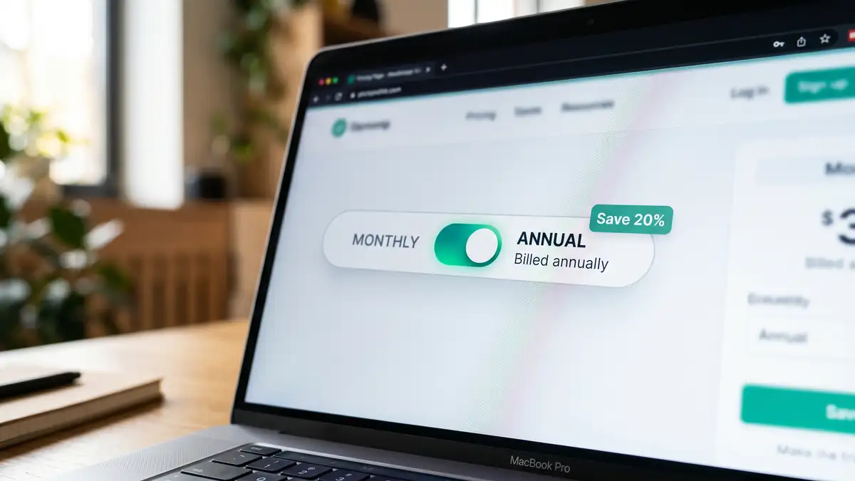
The mechanic is pure choice architecture. When you set the toggle default to "Monthly", 70% to 75% of customers select monthly billing even when you offer a 15% to 20% annual discount. The discount sits in their peripheral vision but the default carries the decision. Flip the toggle default to "Annual", show the same 15% to 20% discount badge, and 55% to 65% of customers now select annual.
That 15 to 20 percentage-point shift is worth real ARR. A $20M ARR SaaS with average customer paying $200 per month picks up $4M to $5M in annual prepaid commitments without a single price change. The cash flow benefit is significant. The retention benefit is bigger: Growth Unhinged's data shows annual customers churn at less than half the rate of monthly customers because the recommitment friction is real. This is the single highest-conviction A/B test on a B2B SaaS pricing page.
How Should You Structure Tiers and Plan Names?
The industry standard is 3.5 tiers. Three published tiers plus an Enterprise "Contact Sales" option covers 80% of mid-market B2B SaaS, per Orb's tiered pricing research. Plan naming is shifting in 2026 from generic "Starter / Pro / Enterprise" labels to role-based ("For Individuals / For Teams / For Enterprises") or usage-based ("Up to 5 Users / Up to 25 / Unlimited") naming, per Paddle's pricing page teardown. The role-based pattern works better because it tells the buyer which tier is theirs before they read a single feature.
Feature ladder design matters more than naming. Differentiate three to five meaningful capabilities between tiers, never fifteen to twenty. The middle tier should clearly own the most-popular use case. The Enterprise tier should signal "compliance, SLA, dedicated support" not "more API calls". This is the same principle peppereffect installs across the GTM motion choice: structure should make the right decision obvious, not exhaustive.
| Pricing Tier | Buyer Profile | Anchor Features | Common Mistake |
| Tier 1 (Free / Starter) | Individual user, evaluator | Core feature only, capped usage | Too generous (cannibalizes paid) |
| Tier 2 (Pro / "Most Popular") | Small to mid team, primary buyer | Full features, collaboration, integrations | Missing decoy emphasis |
| Tier 3 (Business / Scale) | Mid-market, multi-team | SSO, audit logs, priority support, SLA | Indistinct from Enterprise |
| Tier 4 (Enterprise / Contact) | Large org, security-driven | Custom SLA, dedicated CSM, compliance | Hidden behind "Contact Us" wall |
Sources: Orb Tiered Pricing Examples, Paddle Best SaaS Pricing Pages, Pipelineroad Best Practices
Your pricing page should compound conversion across every visit. peppereffect installs the conversion infrastructure, not just another redesign.
See the Freedom Machine Architecture →How Do You Reduce Friction Without Hurting Lead Quality?
Form friction is the single most measurable variable on a pricing page. Each additional form field cuts conversion 0.5% to 3%, per Orbitforms' field-reduction research. Cutting from six fields to three typically lifts signup conversion 15% to 25%. The classic mistake is asking for company size, role, phone, and use case up front. None of that is needed for trial signup. Move the qualifying fields into the in-product onboarding flow where the buyer is already committed.
The credit-card-required question is more nuanced. Removing the credit card increases signup volume by 30% to 50% but conversion to paid drops correspondingly. Growth Unhinged's data shows credit-card-required trials convert at 25% to 35% (good) to 50% to 60% (great), versus 8% to 12% (good) to 15% to 25% (great) for no-credit-card trials. The trade-off is volume versus quality. For high-velocity, low-ticket B2B SaaS, run no-credit-card. For higher-ticket B2B with sales-assist, require the card to filter intent.
Multi-step versus single-step signup also matters. Multi-step reduces abandonment 10% to 15% for complex products (e.g., usage-based pricing requiring estimated traffic) but lowers conversion 5% to 10% for simple products, per Insivia's multi-step research. Poor form error handling raises abandonment 15% to 25%. Real-time validation, inline error messages, and clear progress indicators are non-negotiable. This is the same friction-elimination discipline that drives B2B lead generation across the funnel.
Why Is Mobile Pricing Page Conversion 30% to 50% Lower Than Desktop?
Mobile pricing pages underperform desktop by 30% to 50% when not specifically optimized, per Baymard Institute's mobile UX research. The gap matters because 40% to 50% of B2B SaaS site sessions now come from mobile. Mobile traffic shows up at the awareness stage; desktop conversions happen later. If the mobile pricing page is broken, the brand impression is set before the buyer ever reaches desktop intent.
The fix is mobile-first design, not responsive afterthoughts. Stack pricing cards vertically in a single column. Place the annual / monthly toggle ABOVE the cards, not beside them. Use 48 pixel by 48 pixel minimum touch targets for CTAs. Add a sticky bottom CTA on scroll. Compress feature comparison into an expandable accordion rather than a 4-column scroll-right table. Test on actual devices, not just browser emulators. The companies that get this right pick up a 20% to 30% lift in mobile-originated trial signups.
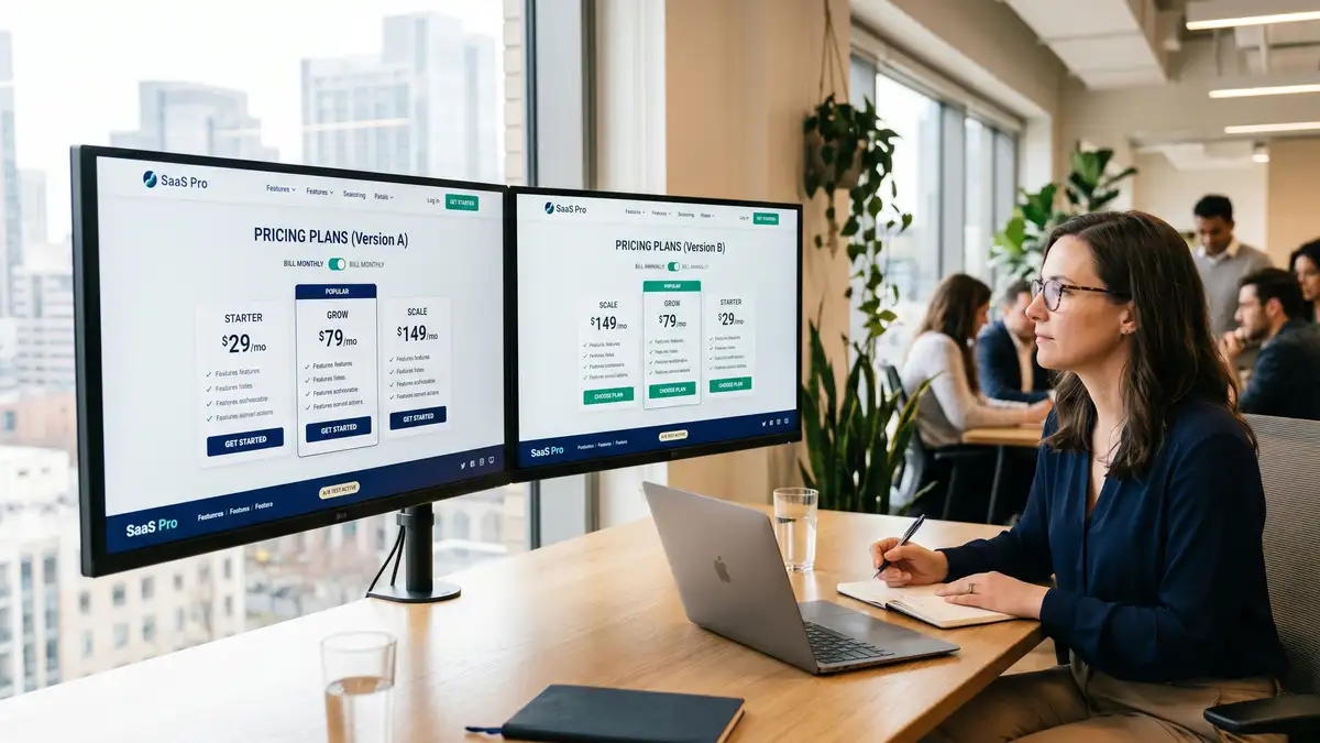
What Are the Highest-Leverage A/B Tests for a Pricing Page?
Run these in order. Each requires a minimum of 2 weeks per arm and 200 to 500 conversions per arm to reach significance, per Unbounce's 2026 A/B testing guide and VWO's testing case studies.
| Test # | Variable | Expected Lift | Time to Significance |
| 1 | Annual default toggle (monthly → annual) | +15 to 20% ARR | 2 to 3 weeks |
| 2 | "Most Popular" decoy emphasis on middle tier | +10 to 15pp middle-tier selection | 3 to 4 weeks |
| 3 | CTA copy / colour (Try / Start / Get) | +5 to 15% click-through | 2 to 4 weeks |
| 4 | Form field reduction (6 → 3 fields) | +15 to 25% signup conversion | 2 to 3 weeks |
| 5 | Social proof above vs below fold | +5 to 10% conversion | 3 to 4 weeks |
| 6 | Credit-card-required toggle (with secondary trial-to-paid as success metric) | Volume vs quality trade-off | 4 to 6 weeks |
Sources: Unbounce A/B Testing Pricing 2026, VWO A/B Testing Examples, Tryflint Social Proof Statistics, Orbitforms Form Field Research
The cumulative 6-month effect of disciplined A/B testing on the pricing page is a 20% to 25% conversion lift, per Unbounce's longitudinal case studies. For a $20M ARR SaaS, that is $4M to $5M of pure-margin upside, and it shows up directly in the B2B pricing strategy as conversion-driven ACV expansion.
What Are the 7 Most Common Pricing Page Mistakes?
| Mistake | Symptom | Fix |
| 1. Hidden enterprise pricing | 15 to 25% drop in inbound qualified leads | Show a starting range or quote calculator |
| 2. Inconsistent value communication | Buyers cannot tell which tier is theirs | Move to role-based or usage-based plan names |
| 3. Excessive feature complexity | Decision paralysis, high bounce | 3 to 5 meaningful differences max per tier |
| 4. No social proof above the fold | Conversion drops below benchmark | Logo bar + 1-3 testimonials adjacent to CTA |
| 5. Broken mobile experience | 30 to 50% mobile conversion gap | Mobile-first design, sticky CTA, accordion |
| 6. Unjustified public discounting | Anchors low expectations; damages price integrity | Only use annual-billing discount; remove others |
| 7. Missing or generic FAQ | 10 to 15% conversion loss vs pages with FAQ | 5 to 8 pricing-specific questions only |
Sources: Monetizely 10 SaaS Pricing Mistakes, Baymard Mobile UX 2025, Sixteen Ventures Discount Mechanics, CXL SaaS Pricing Pages
Avoid This Mistake
Do not publicly discount the page (10% off, summer sale, etc.) outside of the annual billing toggle. Discounts anchor low expectations and damage price integrity. If you need to discount to close, do it in private deal negotiation, not on the public pricing page. Public discounting on a B2B SaaS pricing page is the strongest signal of pricing weakness.
How Are AI Search Engines and the Shift to Usage-Based Pricing Changing the 2026 Pricing Page?
Two structural shifts are reshaping the B2B SaaS pricing page in 2026.
Shift 1: AI search engines now cite pricing pages directly. ChatGPT Search, Perplexity, and Google AI Overviews actively quote and cite pricing pages when answering buyer queries like "What is the cheapest CRM for a 25-person team?" or "Which SaaS analytics tool has the best free tier?" per ICONIQ's State of Go-to-Market 2026. To get cited, your pricing page needs schema.org Product structured data, clear section headers, descriptive text alongside prices (not just numbers in image carousels), and accessible feature lists for AI extraction. Stripe, Slack, and Figma now publish SEO-optimized supporting content around their pricing pages specifically to win AI search citations, per Paddle's AI pricing analysis.
Shift 2: Usage-based and hybrid pricing now applies to 40% to 50% of high-growth SaaS. The shift from pure seat-based to consumption or hybrid is documented in Flexera's seats-to-consumption analysis. Two forces drive it: AI workloads create non-linear compute costs that seat-based models cannot capture, and buyers increasingly demand value-aligned pricing. Hybrid pricing pages have a different anatomy than seat-based: they include a usage calculator above the tier cards, show worked examples ("at 50,000 API calls, you pay X"), and surface usage caps inside each tier. The pricing page becomes a calculator, not a price list.
What Does a 90-Day Pricing Page Optimization Playbook Look Like?
Most teams over-engineer the redesign and under-engineer the measurement layer. The sequence below installs the operating discipline first, then the experiments. This is consistent with the cadences documented across Unbounce, CXL, and peppereffect's installations for SaaS clients.
Weeks 1-2: Baseline and audit. Deploy a heatmap tool (Hotjar, Microsoft Clarity, Crazy Egg). Configure GA4 events for CTA clicks, form starts, form abandonments, and trial signups. Capture current pricing-page-to-trial%, bounce rate, time-on-page, traffic source mix, and mobile vs desktop split. Interview 10 to 15 recent converters and 10 to 15 bouncers to surface qualitative friction points.
Weeks 3-6: High-conviction A/B tests. Run the annual default toggle test first (+15 to 20% ARR expected). Then run the "Most Popular" decoy emphasis test (+10 to 15 percentage point middle-tier shift). Then CTA copy and colour. Minimum 2 weeks per test, 200 to 500 conversions per arm to reach statistical significance.
Weeks 7-10: Friction reduction. Cut form fields from six to three. Test the credit-card-required toggle (using trial-to-paid as the success metric, not signup volume). Add real-time validation. Test multi-step flow if product complexity warrants it. Expected cumulative lift: 15% to 25% signup conversion.
Weeks 11-13: Social proof and trust. Refresh the customer logo bar (8 to 12 recognizable brands). Add G2 and Capterra badges. Place 1 to 3 quantified testimonials adjacent to the primary CTA. Add SOC 2, GDPR, and ISO badges near the payment fields. Expected lift: +5 to 10%.
Weeks 14 and beyond: Iterate and scale. One or two experiments per month. Measure downstream trial-to-paid conversion and LTV-by-cohort, not just signup volume. Run a weekly cross-functional review with marketing, product, and revenue operations. This is the operating cadence that turns the pricing page into a compounding asset, not a static artifact.
Key Takeaway
The pricing page is a system, not a design project. The 90-day playbook installs the measurement layer, then the high-conviction tests, then the friction-reduction work. Skipping the baseline phase is the most common failure pattern. You cannot optimize what you have not measured.
Frequently Asked Questions
What is a good pricing page conversion rate for B2B SaaS?
For B2B SaaS running a free trial with no credit card required, a good pricing-page-to-trial conversion rate is 8% to 12%, and a great one is 15% to 25%. With credit card required, the bar shifts upward: good is 25% to 35%, great is 50% to 60%. Freemium self-serve sits at 3% to 5% good and 6% to 8% great. Pricing-page bounce rates of 40% to 50% are healthy; above 60% signals a problem. These benchmarks come from Lenny Rachitsky's free-to-paid analysis, Kyle Poyar's 2026 report, and ChartMogul's SaaS conversion data.
How many pricing tiers should a SaaS pricing page have?
The industry standard is 3.5 tiers: three published tiers plus an Enterprise "Contact Sales" option. Pricing pages with too few tiers (two) leave money on the table by not capturing the middle-buyer segment with a clear "Most Popular" choice. Pricing pages with too many tiers (five or more) trigger decision paralysis and increase bounce rates. The middle tier should be visually elevated with a "Most Popular" badge; this single decoy treatment shifts 10 to 15 percentage points of buyers toward that tier and lifts ARPU 7% to 8%. Source: Orb tiered pricing examples.
Should I require a credit card for the free trial?
It depends on your motion. No-credit-card trials produce 30% to 50% more signups but lower trial-to-paid conversion (8% to 25% good-to-great range). Credit-card-required trials produce fewer signups but much higher conversion (25% to 60% good-to-great range), per Growth Unhinged's 2026 data. The right answer depends on whether your top-of-funnel constraint is volume or qualification. If sales capacity is the constraint, require the card. If awareness is the constraint, drop it. Many teams test both with separate audience segments.
How big should the annual billing discount be?
The industry standard annual discount is 10% to 20% off the equivalent monthly rate, with 20% being the most common in 2026. The discount itself matters less than the toggle default. Setting the toggle to "Annual" by default shifts 15 to 20 percentage points of buyers into annual billing and adds 15% to 20% to ARR, per Sixteen Ventures' discount mechanics analysis. Annual customers also churn at less than half the rate of monthly customers, so the LTV lift compounds the immediate ARR gain. This is one of the highest-leverage moves you can make to scale revenue without scaling headcount.
Should I publish enterprise pricing or hide it behind "Contact Us"?
Publishing a starting range ("Enterprise: starting at $500/month, contact us for custom pricing") increases inbound qualified leads 15% to 25% but reduces average deal size 5% to 10%. Hiding pricing entirely behind "Contact Sales" produces fewer leads but higher-value deals. Most mid-market B2B SaaS ($10M to $40M ARR) benefit from publishing a starting range; pure enterprise SaaS ($50M+ ARR) often hides pricing. The mistake is hiding pricing without explaining what enterprise includes. Source: Monetizely on SaaS pricing mistakes.
What is the most important A/B test to run on a pricing page?
The annual/monthly toggle default. This single test produces the largest documented ARR lift (15% to 20%) of any pricing-page experiment, with zero change to actual pricing. Set the default to "Annual" with a 15% to 20% discount badge clearly visible. The default carries the decision; 55% to 65% of buyers will accept it, versus 25% to 30% who will manually switch from a monthly default. Run this test first. Run everything else second. peppereffect installs this test as part of every RevOps engagement for B2B SaaS clients.
How does AI search affect pricing page strategy in 2026?
AI search engines (ChatGPT Search, Perplexity, Google AI Overviews) now actively cite pricing pages when answering buyer queries. To get cited, your pricing page must include schema.org Product structured data, descriptive text near each price (not just numbers in image carousels), text-based feature lists (not graphical comparison tables that AI cannot parse), and pricing-specific FAQ sections. Companies that have built AI-search-friendly pricing pages are capturing a measurable share of buyer attention before the buyer ever visits a competitor. This is the same dynamic peppereffect installs through generative engine optimization. Source: Paddle on AI and the pricing playbook and ICONIQ State of GTM 2026.
Engineer Your Pricing Page Into a Compounding Conversion Asset
peppereffect installs the pricing page operating system for $10M to $40M ARR B2B SaaS: measurement layer, high-conviction A/B testing pipeline, friction-reduction roadmap, AI-search optimization, and the 90-day install playbook. The Freedom Machine for the Agentic Era.
Book Your Growth Mapping CallResources
- Lenny Rachitsky on Free-to-Paid Conversion Benchmarks
- Growth Unhinged 2026 Free-to-Paid Conversion Report (Kyle Poyar)
- ChartMogul SaaS Conversion Report
- FirstPageSage 2026 SaaS Freemium Conversion Benchmarks
- CausalFunnel 2025 Bounce Rate Benchmarks
- Paddle: The Best SaaS Pricing Pages Teardown
- CXL: 8 Keys to Value-Based SaaS Pricing Pages
- Orb: Tiered Pricing Examples
- The Decision Lab: The Decoy Effect
- Sixteen Ventures: Pricing Page Discount Mechanics
- Unbounce: 2026 Guide to A/B Testing Your Pricing
- Baymard Institute: Mobile UX Research
- Orbitforms: Reduce Form Fields to Increase Conversions
- Tryflint: Social Proof Performance Statistics
- Paddle: How AI Has Rewritten the Pricing Playbook
- Flexera: From Seats to Consumption
- ICONIQ Growth: State of Go-to-Market 2026
- Monetizely: 10 Common SaaS Pricing Mistakes