Most B2B SaaS churn dashboards answer the wrong question. They tell you how many customers left and when they left, but rarely why — and "why" is the only variable that determines whether next quarter's churn rate goes up or down. SaaS churn analysis is the diagnostic discipline that separates descriptive churn reporting (the post-mortem) from causal churn diagnosis (the intervention). The companies that compound net revenue retention past 120% have learned to do the second; the companies stuck at 95% NRR are still doing the first.
This guide installs the analytical architecture mid-market B2B SaaS ($10M-$40M ARR) needs in 2026: a six-category driver framework that classifies every churn event by causal root, an exit-interview methodology that surfaces the truth instead of polite excuses, predictive churn models that flag at-risk accounts 30-90 days ahead, and the operational save-rate motion that turns analysis into retained revenue.
The descriptive vs diagnostic distinction
Descriptive churn analysis tells you the bus crashed. Diagnostic churn analysis tells you the brakes failed because of a manufacturing defect that affects every bus on the road — and that you have 30 days to fix the next one before it crashes too.
Three failure modes recur across every $10M-$40M ARR B2B SaaS we audit: churn measured only at lagging level (annual, by ARR), no causal classification of churn events, and exit interviews that capture polite fiction rather than diagnostic truth. Programmes that fix all three typically lift NRR 8-15 percentage points within 12 months — not because they shipped a new feature, but because they finally understood what was breaking.
The Diagnostic Test
For every account that churned last quarter, ask: "Can I name the specific causal driver in one sentence, with corroborating data from at least two independent sources (CSM notes, exit interview, product analytics)?" If you cannot, your churn programme is descriptive. The CFO sees the number, the CSM sees a list of accounts, but nobody can answer the question that determines next quarter's number.
The 2026 churn benchmarks that anchor the diagnosis
Without numbers, "high churn" is theatre. Here is what 2026 data actually says about healthy versus alarming B2B SaaS churn — drawn from ALM Corp's 2026 SaaS analysis citing Recurly's 2025 Churn Report, CustomerScore's 2026 benchmarks, and Genesys Growth's 33-statistic compilation:
| Metric | Healthy | Concerning | Alarming |
| Annual customer churn (B2B SaaS, all) | 3-5% | 5-7% | 7%+ |
| Annual customer churn (Mid-Market $10K-$100K ACV) | under 5% | 5-8% | 8%+ |
| Annual customer churn (SMB <$10K ACV) | 5-7% | 7-12% | 12%+ |
| Monthly gross revenue churn (Mid-Market) | 1-3% | 3-5% | 5%+ |
| Monthly gross revenue churn (SMB) | 3-5% | 5-7% | 7%+ |
| Voluntary vs involuntary split | ~74% / 26% | — | — |
Sources: Recurly 2025 Churn Report (via ALM Corp), Oliver Munro 2026 SaaS Statistics, Churnfree 2026 Benchmarks, CustomerScore 2026.
The structurally important number is the voluntary-vs-involuntary split. Oliver Munro's 2026 compilation confirms B2B SaaS averages 2.6% voluntary + 0.9% involuntary annual churn — meaning roughly 26% of all churn is caused by failed payments, expired cards, and dunning gaps that can be recovered with operational hygiene alone, not product improvement. Programmes that lump these together miss the easiest possible win.

The six-category churn driver framework
Every B2B SaaS churn event resolves to one of six causal categories. Programmes that classify every loss into this framework — and weight intervention spend by frequency — operate fundamentally differently from programmes that report aggregate churn rate and hope.
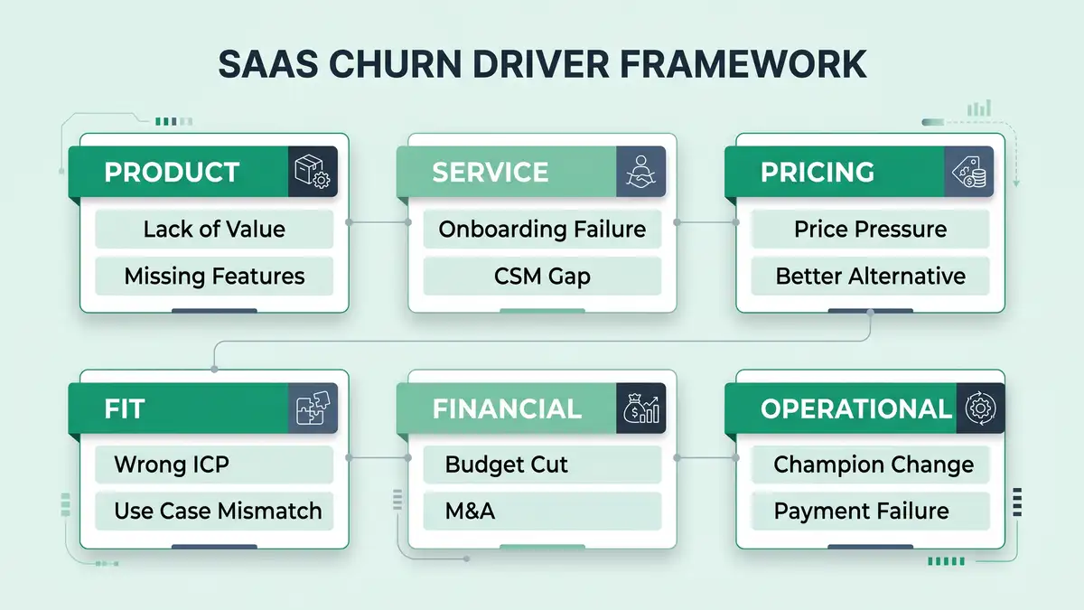
Category 1: Product (lack of value, missing features)
The customer never reached the activation state, never adopted the core feature, or hit a capability ceiling that a competitor did not have. This is the most expensive category to fix because it requires roadmap intervention — but it is also the most diagnostic, because it surfaces directly through usage analytics. If a churned account had <30% feature adoption depth at month 3, the cause is product fit, not service.
Category 2: Service (onboarding failure, CSM gap)
The customer had the right product and the wrong implementation experience. Underrun onboarding, no defined activation criteria, CSM coverage misaligned with ACV tier. This category clusters in the first 90 days and is fixable inside one quarter — typically the highest-ROI intervention layer.
Category 3: Pricing (price pressure, better alternative)
Stated price objection masks one of two underlying realities: the customer never perceived enough value to justify the price, or a competitor priced more aggressively for comparable value. Diagnostic interviews must distinguish "too expensive" (value gap) from "we found cheaper" (competitive alternative). The interventions are different.
Category 4: Fit (wrong ICP, use case mismatch)
The customer should never have been sold the product. Wrong company size, wrong industry, wrong workflow. This category exposes acquisition discipline failures, not retention failures — and the only fix is upstream tightening of MQL definition, lead scoring rigour, and SDR qualification — anchored by the SaaS sales playbook.
Category 5: Financial (budget cut, M&A)
The customer was happy with the product but lost the budget — economic downturn, M&A integration, layoffs. Largely uncontrollable but predictable: economic-event churn clusters around macro shocks and disclosed M&A. Programmes can model exposure but cannot prevent.
Category 6: Operational (champion change, payment failure)
Two distinct sub-drivers with one shared label. Champion change — the executive sponsor left, replaced by a successor with different priorities — accounts for 20-30% of mid-market churn in our audits. Payment failure — expired cards, failed dunning — accounts for the entire 26% involuntary share. Both are operationally addressable through disciplined CRM automation and dunning workflows.
The "they wanted cheaper" trap
Exit interviews routinely surface "price" as the top reason customers churn. The data almost always tells a different story. Pricing-driven churn typically accounts for 10-15% of B2B SaaS losses; the much larger drivers are activation failure (Category 2) and product fit (Category 1). Programmes that take exit-interview answers at face value waste budget on price discounts that fix nothing.

The seven-step churn analysis methodology
Most B2B SaaS teams confuse "running a churn report" with "doing churn analysis." The difference is methodology. Here is the seven-step diagnostic system we install for $10M-$40M ARR clients — adapted from the Pecan AI predictive analytics framework and validated against 2026 retention benchmarks.
Define churn precisely (event + window + segment)
"A customer churned" is too imprecise to analyse. Define the churn event as a specific contract end without renewal, within a defined window (12 trailing months), segmented by ACV tier and cohort. Without these three boundaries, every analysis afterward is comparing apples to oranges.
Separate voluntary from involuntary at the event level
Tag every churn event as voluntary (active cancellation) or involuntary (payment failure, dunning timeout). The 26% involuntary share has a different root cause structure and a different intervention. Mixing them masks both signals.
Pull cohort retention curves by acquisition month
Plot retention by month-of-cohort. Cliffs at month 1-3 indicate onboarding failure (Category 2) — diagnose against SaaS onboarding best practices. Cliffs at month 6-9 indicate activation depth failure (Category 1 or 2). Cliffs at month 12+ indicate value erosion or competitive displacement (Category 1 or 3). The cliff location is itself diagnostic.
Conduct structured exit interviews on 60%+ of voluntary churn
Not surveys — 30-minute calls with an analyst, not a CSM. Standard 8-question script: what triggered the cancellation, what was the alternative chosen, what would have prevented it, who else evaluated the decision, when did doubt first emerge, what worked well, what did not, what would you tell us. Top-decile programmes hit 60%+ response rate by offering a $200 gift card and a 30-minute commitment cap.
Triangulate exit-interview claims against product analytics and CSM notes
An exit interview that says "missing features" while product analytics show 20% feature adoption is not a missing-features problem — it is an activation problem. Always triangulate against at least one independent data source. The customer may not know why they left; the data does.
Build a Pareto chart of causal categories
For the trailing 12 months, classify every churn event into one of six categories and chart frequency. Top-decile programmes find that 2-3 categories typically account for 60-70% of churn — and those are where 80% of intervention budget should land. Programmes that spread budget evenly across all six categories produce no measurable lift.
Build a predictive model that scores active accounts on those drivers
Once you know the top causal drivers historically, build a leading-indicator model that scores active accounts on the same signals. Lucid.now's AI churn modeling research documents 75-85% predictive accuracy at 60-day horizons when behavioural signals are wired correctly. Pendo's 2026 churn-prediction tool comparison covers the canonical platforms (Gainsight, Vitally, ChurnZero, Pendo, Catalyst, Totango).

Six failure patterns that destroy churn analysis programmes
Every churn analysis audit surfaces the same recurring failure modes. Each is fixable, but only when named precisely.
Failure 1: Reporting churn rate without segmenting by ACV
Aggregate "5% annual churn" obscures that SMB is churning at 12% while Enterprise is churning at 2%. The interventions are different. Always segment by ACV tier.
Failure 2: Conducting exit interviews via CSM
The CSM who managed the account is the worst possible interviewer — both biased and a sunk-cost stakeholder. Use a neutral RevOps analyst. Truth-rate on causal questions doubles — the same neutrality discipline that agentic workflows apply to feedback collection at scale.
Failure 3: No correlation between exit-interview themes and product analytics
Exit interviews surface stated reasons. Product analytics surface revealed reasons. When they conflict, the data wins. Programmes that report only on stated reasons mistake symptoms for causes.
Failure 4: Ignoring involuntary churn as "ops, not strategy"
26% of churn is a recoverable revenue stream sitting in the dunning queue. Modern card-updater APIs (Stripe, Recurly, Chargebee) recover 50-70% of involuntary churn when wired correctly. Programmes that don't measure this leave material revenue on the table.
Failure 5: Annual analysis only, no quarterly cadence
Churn drivers change quarterly with macro conditions, competitive landscape, and product releases. Annual analysis is a postmortem; quarterly analysis is an early-warning system.
Failure 6: Predictive model built but not wired to CSM workflows
A 90-day churn-risk score that nobody acts on is worse than no score. Wire risk tiers to automated playbooks: red accounts auto-trigger executive escalation, amber accounts surface in weekly 1:1s, green accounts get expansion outreach. CustomerScore's 2026 data finds that 70-80% of churners signal risk 30+ days ahead — but only intervened-on accounts get saved.
The 2026 churn analysis tooling stack
Tooling alone never reduced churn — discipline does. But the right stack accelerates everything else. Pendo's 2026 churn-tool comparison ranks the canonical platforms; below is the canonical mid-market stack.
| Layer | Purpose | Representative tools | Annual cost (1k accounts) |
| Predictive churn scoring | ML-driven risk scoring of active accounts | Pecan AI, Bombora, Vitally AI, ChurnZero, Pendo | $15K-$60K |
| Exit interview collection | Structured interview capture + analysis | Custom (Calendly + Notion + analyst), Userpilot Surveys | $3K-$15K |
| Cohort analytics | Cohort retention curves, drop-off attribution | Mixpanel, Amplitude, ChartMogul, Heap | $10K-$40K |
| Involuntary churn recovery | Card updater, smart dunning, retry logic | Stripe, Recurly, Chargebee, ChurnBuster | $5K-$25K |
Sources: Pendo 2026 Churn Prediction Tools, Pecan AI Churn Analytics, Bombora Churn Prediction.
Total stack cost: $33K-$140K/year for 1,000-account portfolios. Programmes that buy Gainsight Enterprise at $100K+ before they have causal categorisation discipline typically underutilise 70% of the platform.

Want a diagnostic on whether your churn analysis is actually causal — or just descriptive?
The 90-day churn analysis install
Here is how we install the diagnostic system for B2B SaaS clients in a single quarter. The sequencing matters — building a predictive model before establishing causal categorisation produces a confident model trained on noise.
Days 1-30: Diagnose the historical baseline
Pull 12 months of churned accounts. Tag each event voluntary vs involuntary. Conduct exit interviews on 60%+ of voluntary churn (RevOps analyst, not CSM). Triangulate against product analytics and CSM notes. Classify each event into the six-category framework. Build the Pareto chart. Output: a baseline causal profile and the top 2-3 drivers.
Days 31-60: Wire the predictive scoring layer
Deploy a churn-risk model (Pecan, Vitally AI, ChurnZero, etc.) calibrated on the historical drivers. Set red/amber/green thresholds based on observed churn rates at each band. Wire risk tiers into customer success automation playbooks: red auto-escalates to executive, amber surfaces in weekly 1:1s, green gets expansion outreach.
Days 61-90: Validate save-rate and recalibrate
Compare predicted churn (model output) against actual outcomes over 60 days. Measure save-rate by intervention type. Refine model weights, retire ineffective playbooks, document the canonical save motions. The output is a quarterly review cycle that recalibrates against fresh data — churn analysis is not a project, it is a programme.
What "good" looks like at 12 months
A B2B SaaS team that installs this analysis architecture and runs it disciplined for a full year typically lands the following deltas:
- Annual churn down 1.5-3 percentage points (e.g., 7% to 4%).
- Involuntary churn cut 50-70% via card-updater + smart dunning.
- Predictive model accuracy 75-85% at 60-day horizon.
- Save rate on at-risk accounts: 25-40% (versus 5-10% baseline).
- Exit-interview response rate above 60%.
- NRR up 8-15 percentage points (because fewer accounts churn and more accounts expand via the expansion revenue engine).
- Acquisition discipline tightened — Category 4 (Fit) churn drops as ICP enforcement improves.
Those deltas are the natural compounding of measuring causally instead of descriptively. Churnbuster's 2026 retention math frames the economics: a 2-percentage-point reduction in annual churn typically translates to 20%+ revenue impact over 3-5 years through improved retention economics — making churn analysis one of the highest-ROI operational investments in any B2B SaaS portfolio — load-bearing alongside disciplined customer success metrics and SaaS unit economics.
FAQ
What is SaaS churn analysis?
SaaS churn analysis is the diagnostic discipline of identifying the causal drivers of customer cancellation — not just the rate at which it occurs. It combines cohort retention analysis, structured exit interviews, product analytics triangulation, six-category causal classification, and predictive modeling to produce an actionable understanding of why customers leave and which interventions reduce future churn.
What is a good SaaS churn rate?
For B2B SaaS in 2026: healthy annual customer churn sits at 3-5%, concerning at 5-7%, alarming above 7%. By ACV tier: Mid-Market ($10K-$100K) target under 5%, SMB (under $10K) target 5-7%. Monthly gross revenue churn for mid-market healthy 1-3%, SMB healthy 3-5%. The Recurly 2025 dataset shows B2B SaaS averages 3.5% annual (2.6% voluntary + 0.9% involuntary).
What's the difference between voluntary and involuntary churn?
Voluntary churn is active cancellation — the customer chose to leave (price, value, fit, competition, M&A). Involuntary churn is operational failure — expired cards, failed payments, dunning timeouts that are recoverable with operational hygiene. B2B SaaS averages 26% involuntary; programmes ignoring this miss the easiest possible win.
How do you do a churn analysis?
Seven steps: (1) Define churn precisely by event, window, and segment; (2) separate voluntary from involuntary; (3) plot cohort retention curves by acquisition month; (4) conduct structured exit interviews on 60%+ of voluntary churn (analyst-led, not CSM); (5) triangulate exit interviews against product analytics and CSM notes; (6) classify events into six causal categories and build Pareto chart; (7) build a predictive model scoring active accounts on those drivers.
What are the most common reasons B2B SaaS customers churn?
Six causal categories: Product (lack of value, missing features), Service (onboarding failure, CSM gap), Pricing (price pressure, competitive alternative), Fit (wrong ICP, use case mismatch), Financial (budget cut, M&A), Operational (champion change, payment failure). Top-decile programmes find that 2-3 categories typically drive 60-70% of churn — focus intervention there, not evenly across all six.
How accurate are predictive churn models?
Modern AI-driven churn models hit 75-85% accuracy at 60-day forecast horizons when behavioural signals are wired correctly and retrained quarterly. Rule-based models alone typically score 60-70%; hybrid rule + ML composite (the canonical 2026 approach) reaches 80-90%. Critical caveat: the model only delivers value if its outputs wire into CSM intervention workflows, not just dashboards.
Can I reduce involuntary churn without product changes?
Yes — and quickly. Involuntary churn (failed payments, expired cards, dunning timeouts) accounts for ~26% of B2B SaaS churn and is largely operational. Card-updater APIs (Stripe, Recurly, Chargebee), smart retry logic, and pre-renewal payment-method refreshes typically recover 50-70% of involuntary churn within 90 days, with no product or pricing intervention.
How often should I run a churn analysis?
Quarterly cadence as the operational baseline; annual deeper rebuild. Churn drivers shift with macro conditions, competitive landscape, and product releases — quarterly analysis catches the shift; annual analysis is a postmortem. Top-decile programmes treat churn analysis as a continuous programme, not a one-off project.
Architect churn analysis that reduces losses, not just describes them.
peppereffect installs end-to-end churn diagnostic systems for $10M-$40M ARR B2B SaaS — the six-category causal framework, the structured exit-interview methodology, the predictive model wired to CSM playbooks, the operational save-rate machine. Logic-gated execution, not retainer hours.
Book a Growth Mapping Call customer health score formula customer retention architecture support automation playbook
Resources
- ALM Corp — Digital Marketing Strategy for SaaS Companies in 2026 (Recurly 2025 Churn Report)
- Churnbuster — Full Guide to B2B SaaS Churn Rate Management in 2026
- Lucid.now — How SaaS Startups Use AI to Predict Churn
- Churnfree — B2B SaaS Benchmarks: Complete Guide 2026
- Pecan AI — SaaS Churn Analytics: Predict and Prevent
- CustomerScore — SaaS Churn Rate Benchmarks 2026
- Genesys Growth — B2B SaaS Churn Rates: 33 Statistics
- Pendo — Best Churn Prediction Tools for SaaS Teams 2026
- Oliver Munro — 60+ SaaS Marketing Statistics 2026
- Bombora — Customer Churn Prediction Model
- NCBI — SaaS Churn Prediction Using Whale Optimization Algorithm
- SeoProfy — 12 Best SaaS Marketing Strategies 2026